![]() Instructor notes on Unit #2/Project #2
Instructor notes on Unit #2/Project #2
(2%) Assignment #6 Visualizing Language with Typography (Letter). Due Monday, February 24, 2014 at 8:05a.
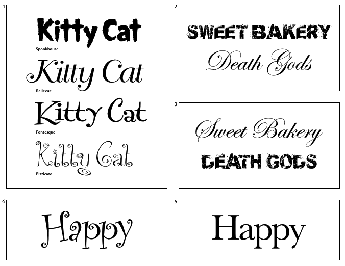
1 Font connotation examples. 2 Poor font connotation. 3 Good font connotation. 4, 5 Views on the right font for the job are subjective. It is very important to discuss these views before showing design options to a client. This communication will spare a designer the trouble of redoing work when a client feels his needs weren’t met.
Image source: Page 52 in Mastering Type : The Essential Guide to Typography for Print and Web Design by Denise Bosler.
Examples:
- Chris Nelson, Connotation of the word read, University of Massachusetts Dartmouth
- Chris Parish, Connotation of the word cash, University of Massachusetts Dartmouth
- Laura Franz, Connotation of the word yes, University of Massachusetts Dartmouth
- Sarah Savage, Connotation of the word stressed, University of Massachusetts Dartmouth
Description:
Complete Lesson 1 and 2 from Typographic Web Design. Here is a supplementary resource: Chapter 2: Letter from Mastering Type : The Essential Guide to Typography for Print and Web Design (see NCSU library). Additionally, the two videos by Laura Franz on the Resources page are helpful as you design with and write about typography for the web.
For “Lesson 1: Compare and Contrast Fonts Online”, please submit your analysis of the fonts you compared. Your analysis can be submitted as an HTML document or a Word document. For example, your analysis for lesson 1 would be submitted as http://www4.ncsu.edu/~youruserid/assignment6/compare-contrast-fonts-online.
For “Lesson 2: Word Connotations”, please submit two documents: 1) your response to the “Writing About What You See” questions on page 26 (this can be HTML or a Word doc) and 2) your exploration of word connotations (this should be in HTML format). For example, your response document would be submitted as http://www4.ncsu.edu/~youruserid/assignment6/word-connotations/response.html and your exploration could be submitted as http://www4.ncsu.edu/~youruserid/assignment6/word-connotations/connotation.html.
(2%) Assignment #7 Choosing and Working with Type (Text). Due Monday, March 3, 2014 at 8:05a.
Please note: This assignment is due on the same day as assignment #8. However, we will work on assignment #7 in class on Friday, February 21.
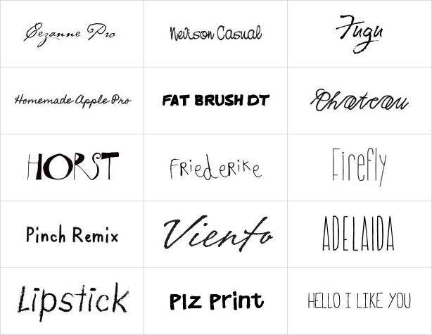
Image source: http://www.youworkforthem.com/list.php?cat=171, screenshot
Examples:
- You Work for Them, Web typography that conveys meaning of a word in a handwriting style
- Katie Whiteman, Expressive and kinetic typography to express tearing down a wall, Darwin, and Edison
Description:
Complete Exercise #1 on page from 100 of Type Rules: The Designer’s Guide to Professional Typography. Optional: Read Chapter 3: Word in Mastering Type : The Essential Guide to Typography for Print and Web Design
Please submit the link to your exploration of communication meaning with typography. For example, your link would be something like this: http://www4.ncsu.edu/~youruserid/assignment7/index.html.
(3%) Assignment #8 Grid: Designing Typographic Layouts with Design History (Encoding). Due Monday, March 3, 2014 at 8:05a.
![]() Instructor notes on Unit #2/Project #3
Instructor notes on Unit #2/Project #3
Please note: This assignment is due on the same day as assignment #7.

Image source: Heather Shaw, Die neue typographie HTML translation, screenshot
Examples:
- Heather Shaw, HTML translations of selected works by Jan Tschichold and Herbert Bayer
Description:
Complete Part 1: Encode of Exercise #2 on pages 254–255 from Type Rules: The Designer’s Guide to Professional Typography. For this assignment, you will use selected works of Josef Müller-Brockmann instead of Jan Tschichold and Herbert Bayer. Please submit a link to your the final HTML version of each poster.
Please select two works from the following by Monday, February 24 at 8:05a. You can find the posters at http://www.blanka.co.uk/Design/Muller-Brockmann and https://www.flickr.com/photos/blankaposters/sets/72157605199393277/ for larger images of the posters.
Submit your selections to Moodle
A) 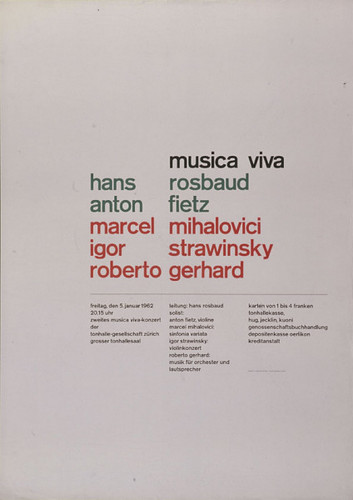 B)
B)  C)
C) 
D)  E)
E) 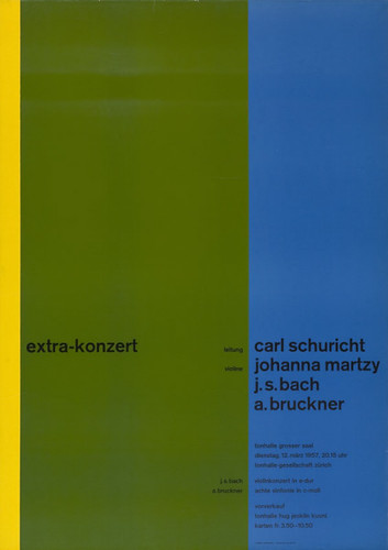 F)
F) 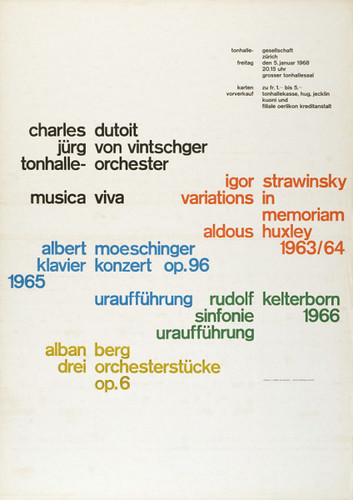
G) 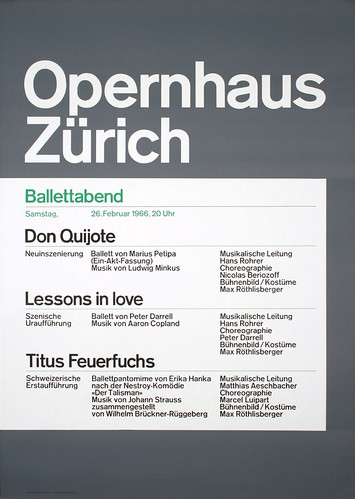 H)
H) 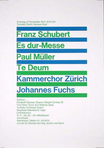 I)
I) 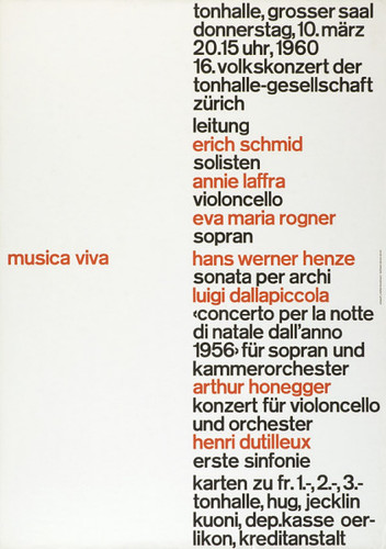
J) 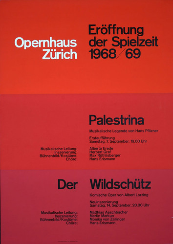 K)
K)  L)
L) 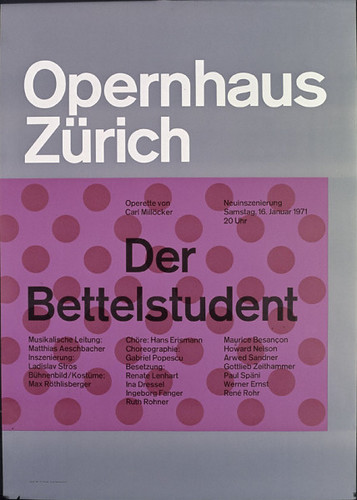
M) 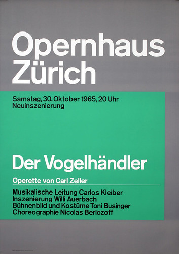
Steps
Part 1: Appropriation
- Step 1: Determine the initial size of the poster. It should be between 770px to 960px wide.
- Step 2: Understand the nomenclature of the grid layout. Sketch the skeleton of the grid using printed paper or an software program to edit images.
- Step 3: Brainstorm what HTML and CSS code you will need to achieve the form (style, appearance) and function (how the information must be designed as an interface). Create a reset.css stylesheet to set a base of your CSS styles. Also, create a second stylesheet to control the specific elements of your print-inspired layout.
- Step 4: Code a rudimentary structure of the form and function of the typographic layout. It may be helpful to set your poster set as a background to code on top of the image.
- Step 5: After getting the basic structure, start modifying the elements to match the form of the poster.
- Step 5: After getting the basic structure, start modifying the elements to match the form of the poster.
Part 2: Extending the Form and Function of Typographic Grids for the Web
- Step 1: Use principles of typography and the differences between designing for print and the Web to consider a new form and function of the modernist design of Swiss typography. For example, while the poster may be set at a different width, what will your print-inspired grid need to consider when designing a page for screen devices (desktop, mobile phones, tablet devices, etc.).
- Step 2: Sketch a model of your typographic grid that addresses specific issues that designers must deal with when designing for the Web.
- Step 3: Use a third external stylesheet that extends the form and function of the initial typographic grid towards a concept that is applicable for the challenges of web design.
(3%) Assignment #9 Grid: Designing Typographic Layouts with Design History (Decoding). Due Monday, March 17, 2014 at 8:05a.
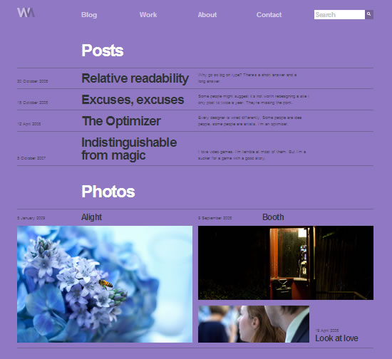
Image source: Wilson Miner’s portfolio, http://wm4.wilsonminer.com/, screenshot
Examples:
- Wilson Miner, portfolio, http://wm4.wilsonminer.com/
- Jason Santa Maria, articles designed with HTML, http://v4.jasonsantamaria.com/articles/ (click on the links in the “Categories” section and then select the images that will appear in the far left column”)
- Visible Language Journal, http://visiblelanguagejournal.com
- Koih Vinh, personal web site, http://www.subtraction.com
- Mark Boulton, presentation and demonstration, “Grids are good too, right?“
Description:
Complete Part 2: Decode of Exercise #2 on page 254–255 fromType Rules: The Designer’s Guide to Professional Typography by using skills gained from the previous assignments in this unit.
Please choose a web site to redesign/design by Monday, March 3 at 8:05a
Submit your selection to Moodle
Choose one page from an existing web site and redesign the interface using principles of good typography inspired by Josef Müller-Brockmann. You can also use your Unit #2 challenge as the page you will design for this assignment. In addition to typographic grid layouts, we will investigate mixing typefaces and choosing the best typefaces to accomplish your tasks of designing for the web.
Please submit each link to the page(s) you have developed.
Steps:
Please note: Each chapter and section comes from http://guidelines.usability.gov/.
“Don’t defer user testing until you have a fully implemented design. If you do, it will be impossible to fix the vast majority of the critical usability problems that the test uncovers. Many of these problems are likely to be structural, and fixing them would require major rearchitecting. The only way to a high-quality user experience is to start user testing early in the design process and to keep testing every step of the way” (“Usability 101”).
Usability: How effectively, efficiently and satisfactorally a user can interact with a user interface. (Usability.gov)
Accessibility The measure of a web page’s usability by persons with one or more disabilities.
- Step 1: “Before starting the new design, test the old design to identify the good parts that you should keep or emphasize, and the bad parts that give users trouble” (“Usability 101”). Read the Introduction of Chapter 1: Design Process and Evaluation from http://www.usability.gov.How to begin the design process and evaluation:
- Step 1.1: Evaluate web sites before and after making changes (Chapter 18: Section 3). We will begin by using parallel design with a partner (Chapter 1: Section 10), which will be an inspection evaluation (Chapter 18, Section 8) You should consider many user interface issues (Chapter 1, Section 7) and then distinguish between what seems to be the most frequent problems and the most severe issues (Chapter 18, Section 5). This can be done in two ways: create a screenshot and annotate the issues or write an evaluation in a document.
- Step 1.2: Set and state goals before starting any design work (Chapter 1: Section 5). This is an important step to make sure you are not overdesigning or trying to make the project so personal that it does not relate to the goals of the participants and organization/company/institution.
- Step 1.3 Understand and meet user’s expectations (Chapter 1, Section 3).
- Step 1.4 Conduct a thorough usability analysis of the current site. For this assignment, here are some of the most important aspects of usability to check:
- Chapter 6, Section 1: Avoid Cluttered Displays
- Chapter 6, Section 2: Place Important Items Consistently
- Chapter 6, Section 5: Establish Level of Importance
- Chapter 9, Section 8: Provide Users with Good Ways to Reduce Options
- Chapter 11, Section 2: Format Common Items Consistently
- Chapter 11, Section 4: Ensure Visual Consistency
- Chapter 11, Section 10: Emphasize Importance
- Chapter 11, Section 11: Highlighting Information
- Chapter 12, Section 1: Order Elements to Maximize User Performance
- Chapter 12, Section 2: Place Important Items at Top of the List
- Chapter 12, Section 3: Format Lists to Ease Scanning
- Chapter 12, Section 4: Display Related Items in Lists
- Chapter 16, Section 1: Organization Information Clearly
- Chapter 16, Section 2: Facilitate Scanning
- Chapter 16, Section 3, Ensure that Necessary Information is Displayed
- Chapter 16, Section 4: Group Related Elements
- Chapter 16, Section 6: Design Quantitative Content for Quick Understanding
- Chapter 16, Section 7: Display Only Necessary Information
- Chapter 16, Section 8: Format Information for Multiple Audiences
- Chapter 16, Section 9: Use Color for Grouping
- Chapter 14, Section 3: Ensure that Images Do Not Slow Downloads
- Step 2: “test your competitors’ designs to get cheap data on a range of alternative interfaces that have similar features to your own” (“Usability 101”). A good way to do this is by conducting a competitive analysis. Big Fork Digital Marketing list six things you can look for when you conducting a competitor analysis: positioning, user experience, content, calls to action, appeal, search <http://www.bigfork.co.uk/assets/__files/bigfork-guide-to-competitor-website-analysis.pdf>
- Optional“Conduct a field study to see how users behave in their natural habitat” (“Usability 101”). In this step, you should involve users in establishing user requirements (Chapter 1, Section 4). “To identify a design’s most important usability problems, testing 5 users is typically enough” (“Usability 101”). http://www.nngroup.com/articles/why-you-only-need-to-test-with-5-users
- Step 3: “Make paper prototypes of one or more new design ideas and test them. The less time you invest in these design ideas the better, because you’ll need to change them all based on the test results…Refine the design ideas that test best through multiple iterations, gradually moving from low-fidelity prototyping to high-fidelity representations that run on the computer. Test each iteration.” (“Usability 101”).
- Step 4 : “Once you decide on and implement the final design, test it again. Subtle usability problems always creep in during implementation” (“Usability 101”). You should use the list of things to check for in step 1.4 to evaluate your redesign. This is a good practice to make sure you are following through with a redesign that is not just a “facelift” but an improvement to the overall design.