Project 3/Unit 3 is based on Part 1, a requirements analysis, of the Model of Pervasive Usability in Website Design.
Assignment #10: Heuristic Evaluation (enCoding) | Functional Requirements (deCoding). Due Friday, April 4, 2014 at 8:05a. (8%)
Access this Moodle link to download an example of a checklist that includes usability and design principles: https://moodle1314-courses.wolfware.ncsu.edu/mod/resource/view.php?id=515023.
Heuristic Evaluation for enCoding (Redesigning a web site)
Description
When redesigning a web site, a heuristic evaluation, which is one method of many usability inspections, will help you audit existing legacy systems. The importance of conducting an usability audit before redesigning the visual aspects of a web site is that you consider what actually need improvements. In “10 Usability Heuristics for User Interface Design“, Jakob Nielsen explains that there are ten “general principles for interaction design. They are called “heuristics” because they are more in the nature of rules of thumb than specific usability guidelines.” A heuristic evaluation allows designers to conduct an usability audit based on human factors principles. In this assignment, you will learn how to conduct an usability audit to determine what design elements you will redesign. As explained on Usability.gov and Usability.net, there are some advantages of doing a heuristics evaluation early in the design process, such as providing early feedback on existing interface designs and finding usability problems that you can improve for a redesign. There are ten usability heuristics for user interface design.
How to plan, conduct, and analyze an heuristic evaluation before writing the final analysis
Sitepoint.com provides five steps to complete an heuristic evaluation:
- Plan your evaluation: develop a list of user requirements in the form of use cases or personas to plan your evaluation by defining the usability problem. To help with building a plan, conduct a brief competitive analysis of 5-10 web sites to determine how the web site you are redesigning compares to other competition.
- Choose your evaluators: you will be the expert conducting the evaluation.
- Review the heuristics: review your user requirements from step 1 (and business requirements if this applies to your usability problem) and develop a checklist based on these requirements and the ten usability heuristics for user interface design. Develop your specific checklist based on http://guidelines.usability.gov as they apply to your specific goals for the redesign.
Workshop (Invention):- Do an initial audit based on the ten usability heuristics. In your Word document, use each of the heuristics as a header, copy and paste the description of each heuristic from http://www.nngroup.com/articles/ten-usability-heuristics.
- Conduct an initial audit based on each heuristic by providing a brief description and screenshot of the issue.
- Based on the goals and use cases you have defined, as well as your initial heuristics, choose at least three guidelines out of each of these usability categories that will be used later to further audit the web site: Chapter 5: The Home Page, Chapter 6: Page Layout, Chapter 7: Navigation, Chapter 9: Headings, Titles, and Labels, Chapter 10: Links, Chapter 11: Text Appearance, Chapter 14: Graphics, Images, and Multimedia, and Chapter 16: Content Organization. Do not attempt to evaluate the web site again until you develop your checklist in step 4.
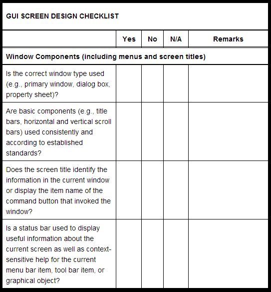
- In your Word document, create a checklist similar to http://it.toolbox.com/blogs/enterprise-solutions/gui-screen-design-checklist-20426. Use the chapter names as your the category name in your checklist. Use the specific guidelines you have chosen from each chapter as each specific checklist item.
- Conduct the evaluation: conduct your evaluation using the checklist.
- Analyze your results: analyze your results from step four to determine which aspects will you focus on for the redesign.
Other resources
- Heuristic Evaluation (Wikipedia)
- Methods – Heuristic Evaluation
- Heuristic Evaluation (Nielsen)
- How to conduct a Heuristic Evaluation (Nielsen)
- Heuristic Evaluation (Usability.net)
- Heuristic Evaluation (Usability.gov)
- Heuristic Evaluation and Its Alternatives
- Heuristic Evaluation — A System Checklist (Pierotti)
- Usability Heuristics for Rich Internet Applications (McMullin & Skinner)
- Eight Golden Rules of Interface Design (Schneiderman)
Functional Requirements for deCoding (Coding a web template)
Description:
While other designers in this class are redesigning a web site, your goal is to deCode an existing web template into HTML format. On the surface, it may seem that your responsibility is to code the web site; however, as we read in previous chapters on typography, the designers job is more than designing an interface or coding. It also includes checking the content for grammatical errors, making sure the headers and other indicators, such as icons, describe the associated content. For this assignment, you will focus your usability audit based on web site requirements, which, as defined on Usability.gov, “are a list of necessary functions, capabilities, or characteristics related to your website and the plans for creating it.” The purpose of a web site requirements is to “focus and prioritize the project plan.” For your web site template, you will focus on two specific types of requirements: functional and quality-of-service. Typically, these two types of requirements might be developed and evaluated separately. For this assignment, you will develop a checklist that combines functional and quality-of-service requirements to evaluate your web site templates before coding. More specifically, your checklist (here is an example and here) will be developed as a cross between Search Engine Journal‘s list of questions for evaluation and a list of evaluative criteria for quality assurance testing.
How to plan, conduct, and analyze web site requirements before coding your web site template
- Plan your requirements: decide which requirements you should focus on. While all requirements are useful, not all requirements may be necessary for your project. To being your requirements, develop an initial evaluation of what code and interactive elements might be needed to encode your web site template by using Fireworks or printing the prototypes.
- Review usability guidelines and design principles: review usability guidelines and design principles that relate to the requirements developed in the first step.
- Develop your checklist: conduct your audit according to a defined list of requirements based on steps 1 and 2.
Workshop (Invention):- Consider what major functional requirements are needed for your web site. For example, does template need background images? Do you need to create columns? Does each column require a different CSS style? Additionally, review design principles to determine visual quality of your current design. Create a Word document to record your responses and screenshots. Or you can use an image-editing program.
- After conducting this initial audit, choose three guidelines fromChapter 9: Headings, Titles, and Labels, Chapter 15: Writing Web Content,
Chapter 14: Graphics, Images, and Multimedia, and Chapter 7: Navigation, and Chapter 10: Links from http://guidelines.usability.gov/. Do not attempt to evaluate the web site again until you develop your checklist in step 3. - In your Word document, create a checklist similar to http://it.toolbox.com/blogs/enterprise-solutions/gui-screen-design-checklist-20426. Use the chapter names as your the category name in your checklist. Use the specific guidelines you have chosen from each chapter as each specific checklist item.
- Conduct your an audit of the requirements: evaluate your web site template based on the web requirements checklist.
- Analyze your audit: analyze your evaluation to determine what you need to focus on for the encoding process from prototype to HTML and CSS.
Visual Usability
“Visual communication of any kind, whether persuasive or informative … should be seen as the embodiment of form and function: the integration of the beautiful and the useful.”
—Paul Rand, A Designer’s Art, p. 3
When designing applications, we know firsthand how challenging it is to focus both on aesthetics and functionality…Education hasn’t kept up with the pace of change: graphic design training teaches how to create “beautiful” or “innovative” interactive designs, but that isn’t enough to guide the design of complex, visual systems; and computer science usability courses don’t yield competition-crushing, desirable interfaces.
—Tania Schlatter and Deborah Levinson, Visual Usability, Introduction
It’s easier to design and expand your application if you have a rationale, but you can’t account for every possible circumstance…Informed decisions require a rationale. By establishing rules that incorporate consistency as a key part of your rationale, you provide yourself with a strong basis for decision-making.
—Tania Schlatter and Deborah Levinson, Visual Usability, Chapter 1
Generally, guidelines from http://guidelines.usability.gov focus on technical aspects of usability even though some of the guidelines, such as Chapter 14: Graphics, Images, and Multimedia and Chapter 10: Links focus on visual aspects of usability. The limitation of relying on these guidelines from logical positivist perspective is that there is less room for interpretation, guided intuition, and flexible creativity. To account for this limitation, scholars and practitioners have used what is called “visual usability”. The term may seem contradictory, but the article “Usability experts are from Mars, graphic designers are from Venus” is proof of a division between visual design and usability. As Luke Wroblewski states in an interview with Joshua Porter, part of the issue may stem “from the fact that many people aren’t versed in what determines how we make sense of what we see. As a result, the assessment of usability largely focuses on “actual usage”…instead of the way that usage is or isn’t supported through visual communication.”
What is at stake? Why should we care about making applications usable by considering visual communication as a central endeavor? Fusion Charts’ “Designed to succeed—How design is playing a strategic role in today’s software products” white paper, which features Mint.com, is one way of realizing the importance of visual usability. As Schlatter and Levinson state,
Compare managing household finances in a desktop spreadsheet program to managing them online with Mint.com: the spreadsheet provides a static view of your current status, and you must manually enter information about your bank accounts and spending. By contrast, Mint.com imports up-to-the-minute data about your finances and uses charts, projections, and recommendation tools to provide highly visual, interactive ways to explore not just where you are now, but how your spending and investments could affect you in the future.
For Assignment #10, we will rely on principles and examples from Visual usability: principles and practices for designing digital applications by Tania Schlatter and Deborah Levinson to help combine our initial usability checklist with some of the typographic design principles we discussed during week 8. The foundation of using a visual usability approach to your final project is to enable you to “start design conversations of your own, avoid common mistakes, make informed decisions, and elevate the ordinary” (p. 310). Schlatter and Levinson provide three meta-principles that you can use to further develop your usability checklist:
- Consistency: “setting and maintaining expectations by using elements people are familiar with.” There are two modes of consistency: internal and external. The authors state that external consistency is fruitless unless you are designing for a suite or overall product line, but another way of thinking about external consistency is how the web site functions and is represented according to expected conventions based on other web sites that it is related to. Doing a competitive analysis is one way to determine external consistency. Internal consistency is considered as visual usability tools that create a consistent experience across the web site. The author note five usability tools: layout, type, color, imagery, treatments, and controls and affordances. You can use these tools to address specific questions related to visual usability of the web site you are redesigning or coding. Additionally, you can specify usability items in your checklist based on each individual usability tool. Elevating the ordinary is especially useful if you are modifying a template. As a designer, what other characteristics or elements on a page would you look for to make sure it is consistent?
- Hierarchy: “To create a visual hierarchy, you must develop a rationale for differentiation supported by an understanding of your audience, and then use that rationale to apply the visual usability tools effectively (Figure 2.1)…In practice, a lack of hierarchy exists when objects all attract the eye equally—that is, when nothing stands out more than any other thing. In concept, visual hierarchy is very similar to organizational hierarchy. It’s an order based on ranks defined as part of a system.” To develop a hierarchy, you should make sure you have an idea of what the users may expect (develop user personas, interviews, etc.) and identify and list the element users expect or need. Next, arrange the flow of steps by organizing the list of elements according to rank. These elements can be designed by using hierarchical characteristics of contrast, position, visual treatment. As a designer, how could you visually show which elements should have greater or lesser hierarchy than others when you are showing partners how you will redesign a site or template?
- Personality: “First, we need to state that you cannot “create” personality. People determine personality based on characteristics interpreted from patterns they’ve detected through perception and experience. Interpretations vary based on norms and expectations—what people expect and are used to—and can be subjective.” This may seem easy. All you have to do is know what people perceive, right? As we read about Dell’s Della site and Balsamo’s writings on gendered design, this is harder than it seems. As stated in Visual Usability, “There are two ways impressions can be characterized at the visceral level: how approachable (or useful) an application appears (i.e., “Does it look like this will allow me to do what I want?”), and whether we like what we see, or find that some aspect of it resonates with us on a personal level.” Conducting interviews or analyzing the sites content are two of many ways to determine and examine a web site’s personality. Next, you can write a personality summary, and explore personality possibilities. As a designer, how could you determine how to design the personality of a web site?
Examples:
Mint.com
Assignment #11: Reporting an Usability Audit. Due Monday, April 7, 2014 at 11:55p. (7%)
Description:
Planning, conducting, and analyzing a requirements analysis is only part of producing an usability audit. The next step is to write an usability audit as an argument for which elements you will redesign or encode from a visual prototype to HTML and CSS. The report is very similar to an argumentative paper in your previous classes.Typically, you have an argument you want to make and you use analytical methods to produce your claims and evaluations of other arguments. For this assignment, you will produce an argument by using a well-developed methodology to analyze the choices you should make for your project. The purpose of writing a technical usability report is provide recommendations for the redesign or encoding process, as well as justification for doing this final project based on your personal, educational, and professional goals.
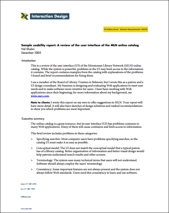
Exercise: In groups of three, compare and contrasts a usability report of the user interface (UI) of the Minuteman Library Network (MLN) online catalog and a retail web application. How do they differ? How are they similar? What kinds of information is report? Is there audience usability professionals or other people? Post some responses here: http://padlet.com/wall/o0c3ba7uqk.
How to write your usability report (our starting point is http://www.usability.gov/how-to-and-tools/methods/reporting-usability-test-results.html) :
Part 1: Brainstorm
- Write an initial summary about what you’ve found. This step is meant to allow you time to reflect on your report. These items are useful to consider when writing an initial summary/reflection: Do you notice any emerging themes (ex: Guiding users interaction; Presenting a credible personality or character; Using typography as an interface;)? What major revisions and/or recommendations would you make based on the usability audit?
- Consider the what, why, and who of your usability report to determine the rhetorical situation of writing your usability report (See Chapter 5 in Technical Writing). Chauncey Wilson offers some usability report tips in tip #2 to ground why we should think about this aspect.
Part 2: Analyze Results
- Analyze the results by marking the severity levels of problems.
- Determine which problems are within the scope of completing your final project within the next few weeks. It is helpful to think about what kinds of severity levels of problems you are considering for the final project. Generally, for this course, it is helpful to focus on three to five severity problems and providing recommendations to resolve the issues. Think about the levels of severity as a mix rather than attempting to fix all critical problems. For example, you may want to focus on fixing two critical problems and three minor problems.
Part 3: Brainstorm recommendations
After analyzing the results, you should develop a set of recommendations that are based on the general guidelines developed from http://guidelines.usability.gov and the visual usability guidelines based on consistency and personality. Visual Usability provides some models of how to write an analysis and recommendation for consistency and personality.
Part 4: Write Your Document
Organize and outline your document (See Chapter 6 in Technical Writing). Usability.gov provides a base organization for reporting, but you will use a template of a usability report provided by the The User Experience Group at Indiana University.
Part 5: Feedback from other reviewers
In an article in Usability Interface, Chauncey Wilson offers some usability report tips. Wilson’s ninth tip is quite useful for this assignment: “Ask for feedback on your report. Usability specialists need feedback too.” On Monday, April 7, please have a draft of your usability report to receive feedback from other reviewers.
The purpose of receiving feedback from other reviewers is to heighten your awareness of what your readers might expect and need, as well as sharpen your focus to decide how you will approach the visual prototypes. Please use the following questions to guide your evaluation of usability report drafts:
- What is the designer doing well?
- Is the document formatted according to the general outline of the template document provided for this assignment? If not, what elements are missing? If so, does the hierarchy of information allow you to understand the flow of the document and what to expect next?
- Does the language present a positive ethos (credibility) or is it laden with too much personal opinion or overly technical jargon?
- Are the recommendations clearly stated? Do the recommendations provide a way to resolve the problems/issues/opportunities in a way that shows exactly how to approach the solution? Or are the recommendations vaguely stated?
- What other improvements do you suggest?
Other resources:
Sample models
- User interface (UI) of the Minuteman Library Network (MLN) online catalog (User.com)
- Retail web application (http://sage-research.com)
- Purdue OWL
- Usability.gov’s sample usability report template
Advice
- “Making Usability Findings Actionable: 5 Tips for Writing Better Reports“
- Chauncey Wilson offers some usability report tips
Part 6: Preparing Prototypes
The next step after the review is to modify your report in order to prepare sketching alternative directions. On Wednesday, April 9, please read through Chapter 4: Layout and Chapter 8: Controls and Affordances to help you develop three different prototypes for each page you are redesigning. Use paper and pencil/pen for sketching. It will be useful to focus your sketches based on the principles of visual usability in terms of layout (alignment, proximity, grid, scale, and white space) and controls and affordances (navigation controls, information display controls, data manipulation controls), as well as design principles we learned in project 2. For people doing deCoding, your purpose is to prototype any changes to the prototype that you recommended (see the “For Everyone” section below) and the HTML code (see the “For deCoders” section below) you will use develop each page of the template.
Examples of what your paper prototypes should look like:
- For Everyone (enCoders and deCoders): Figure 4.6 and Figure 4.7 in Visual Usability; Figure 1 from “Using Wireframes to Streamline Your Development Process“
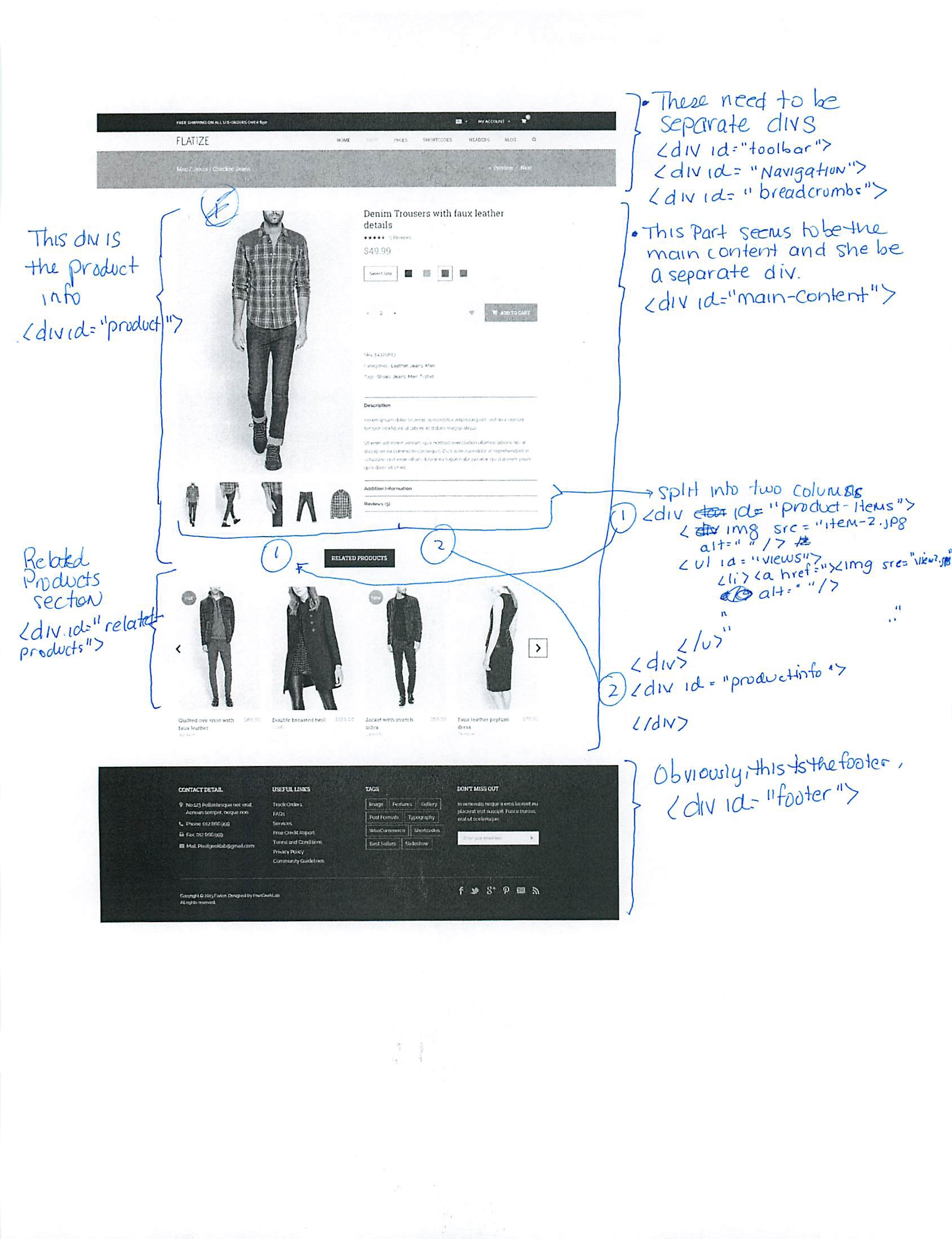
- For deCoders : View a simple example of how you can “prototype” the code with paper and pen/pencil.